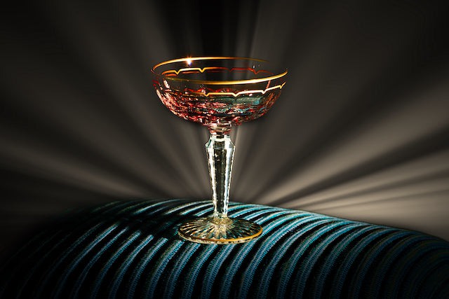
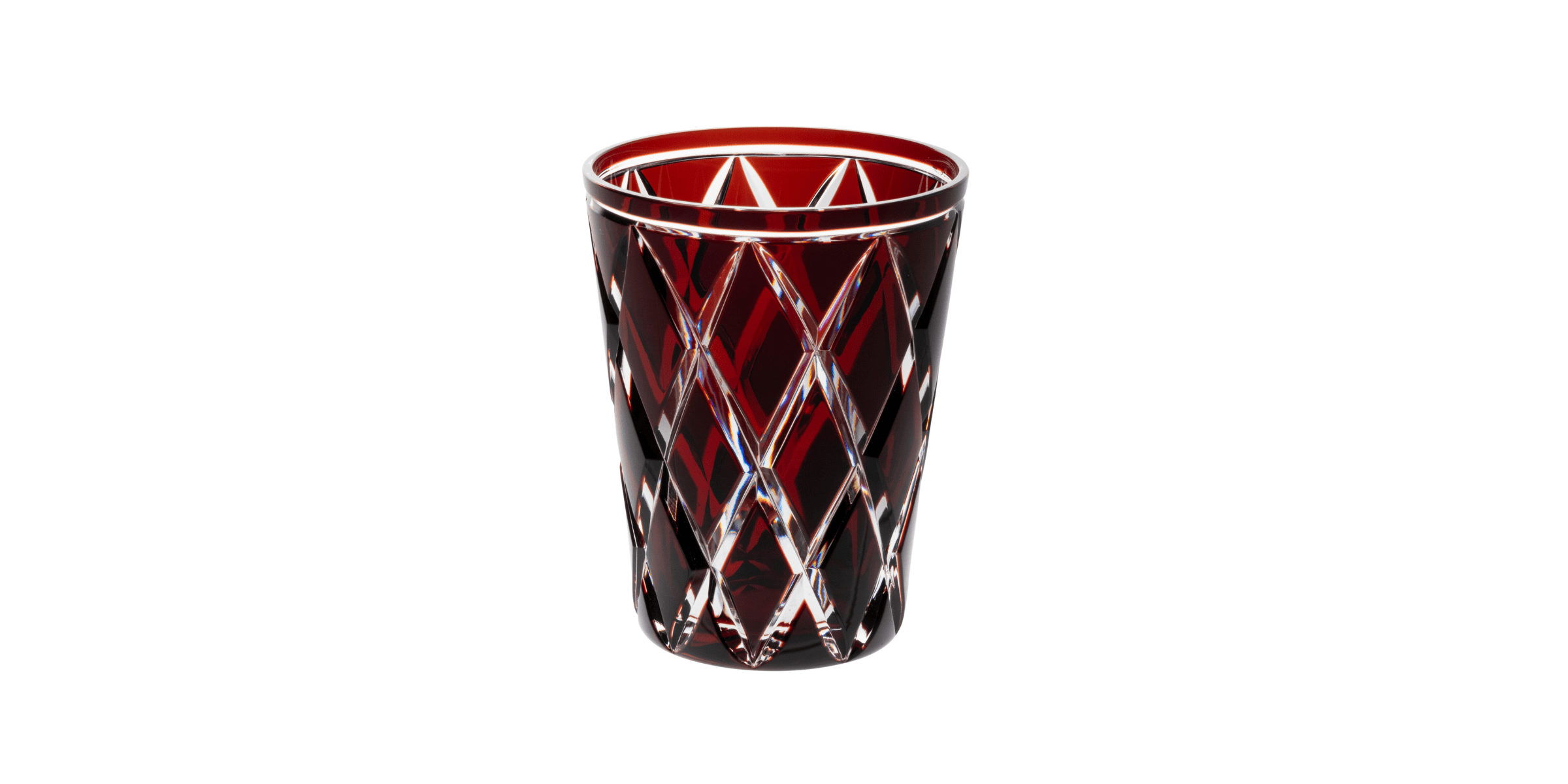
Brilliant as a ruby and as intense as a flame, red coloured crystal is a real eye-catcher and a true symbol of elegance. Associated with royalty and special occasions, today it finds its place on the most refined tables and in the most sumptuous interiors. In the collective unconscious, the colour is now also linked to love and passion. What better time to talk about this romantic colour than the month of February, when love reigns supreme?
In crystal, achieving this vibrant hue is a real challenge, requiring exceptional expertise and a perfect mastery of craft techniques. Thanks to the colour-doubled crystal process, our craftsmen manage to sublimate this flamboyant hue, creating unique pieces that capture the light and the attention. It is the result of a delicate process in which a layer of tinted crystal matches the transparency of the clear crystal, before being precision-cut to reveal sumptuous contrasts. A symbol of refinement and prestige, the colour red has a special history, which we will summarise for you in this blog post.
History & Attributes
The first colour
Red was the first colour to be developed for painting and tinting. In ancient times, red was associated with war, wealth and power. During the Middle Ages, red held both religious significance (the blood of Christ) and, more secularly, signified love, glory and beauty. After the French Revolution, red gained in significance, now also associated with progressive movements.
Dark red is a particularly intense shade of red, but also less vibrant, being less radical in these previously mentioned associations. Dark red is considered to be one of the coldest shades of red, and can therefore be considered an autumn or winter colour.
Before
After
Use the left and right arrow keys to navigate between before and after photos.

Psychology
How & Why should I use it ?
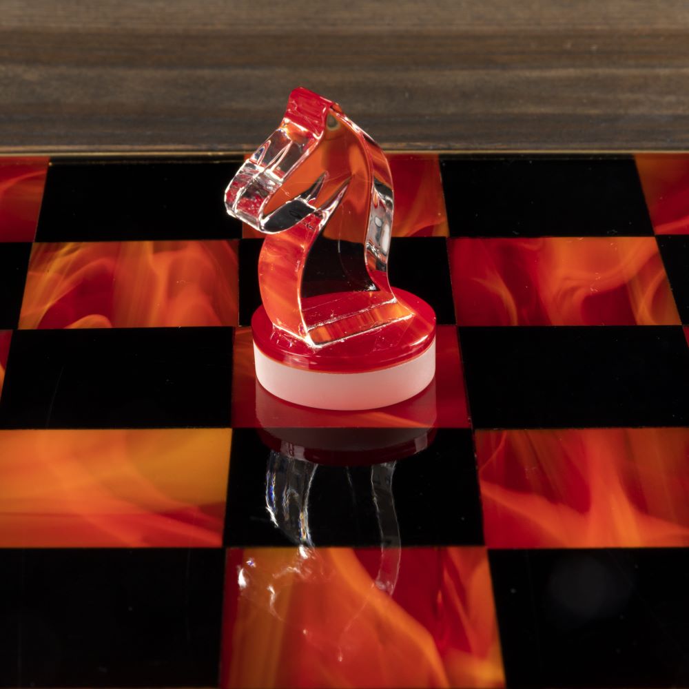
Like all reds, dark red is thought to increase appetite, boost adrenalin and raise blood pressure. As a result, this colour is widely used in restaurants. That said, dark red is very versatile and can be used for a variety of occasions. In interior design, dark red can add warmth to your space, or make a distinguished accent.
Design
With what colours ?
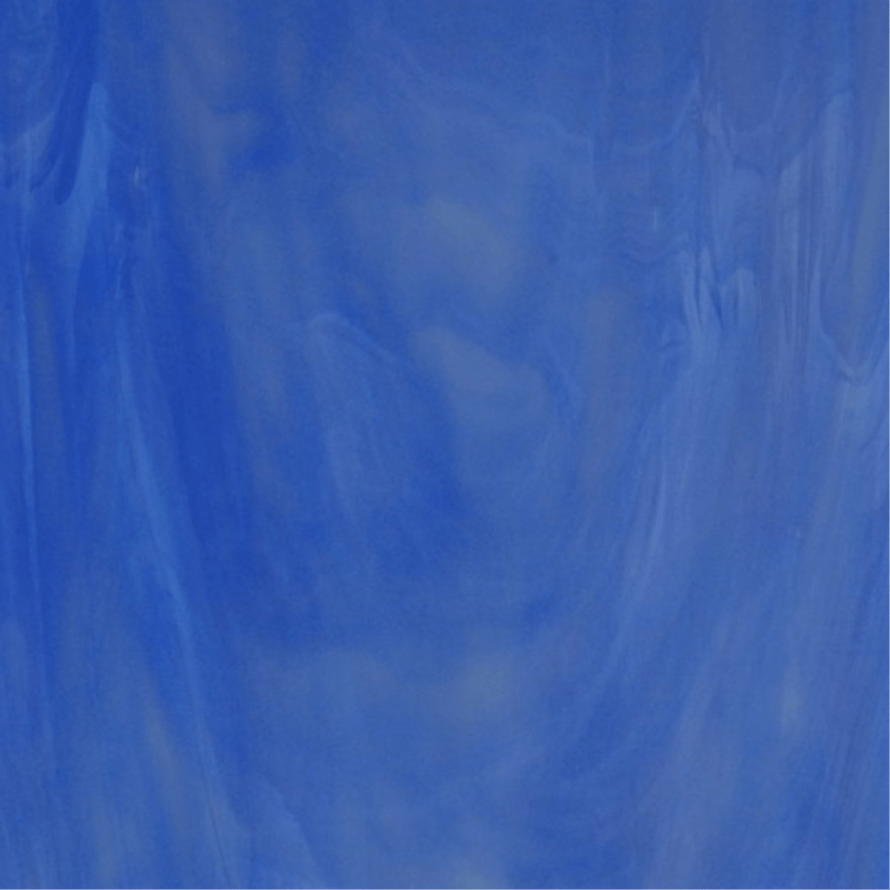
Dark blue
On a complementary level, dark blue and gold are the two colours considered complementary to dark red.
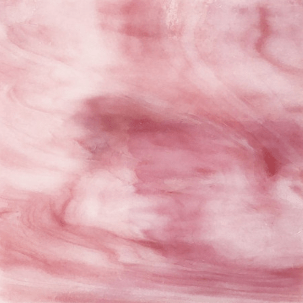
Pink
For a soft, uniform look, pink is the perfect complement to the intensity of red, creating a passionate, vibrant ensemble.
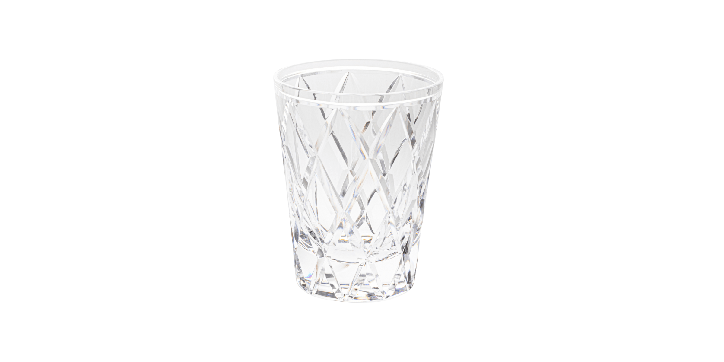
Clear
To bring out the richness of its hue, dark red goes perfectly with clear crystal, which will compliment it without softening it.
Red coloured crystal embodies both the excellence of craftsmanship and the timeless elegance of luxury. Whether illuminating a festive table, sublimating a refined interior or celebrating a precious moment, red makes each piece a true work of art, heir to a centuries-old tradition and an unchanging passion for beauty.