Natural November
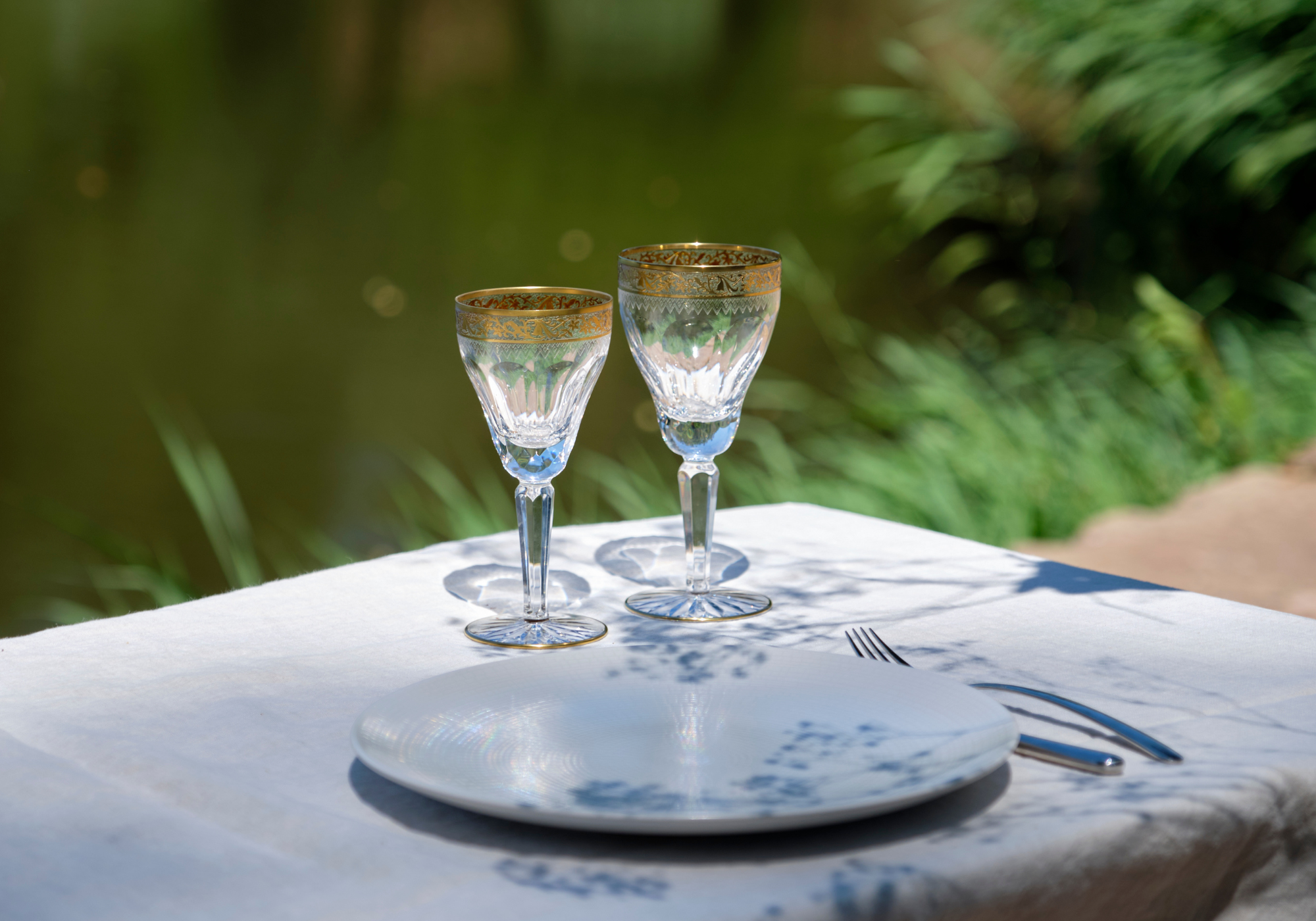
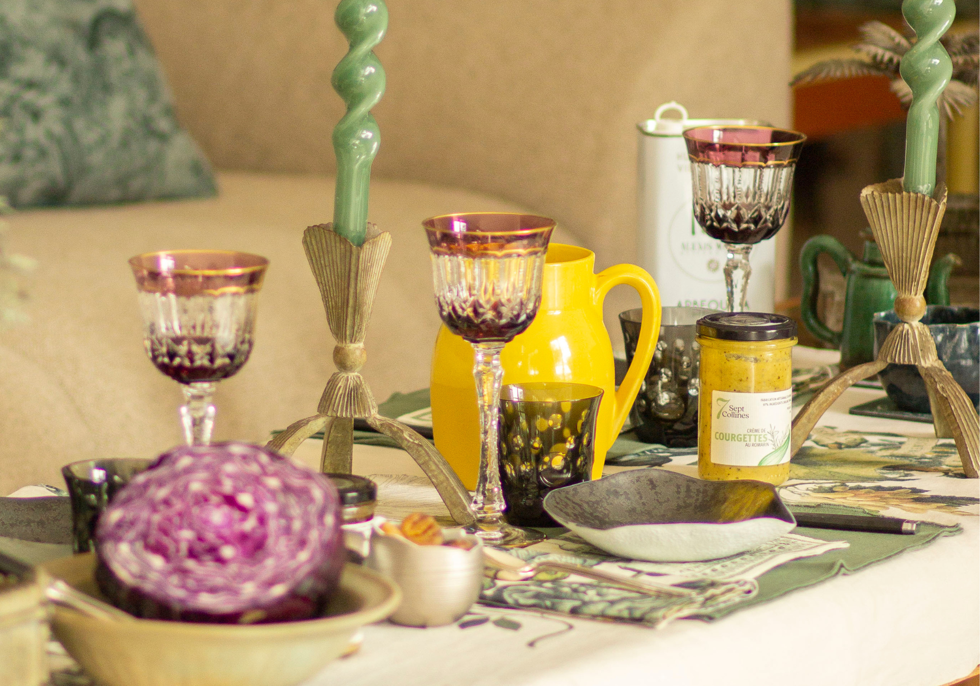
Twirling leaves, breezes and zephyrs, rain and sunshine... Autumn has settled in and heralds the return of heavy sweaters, coffees and spiced teas, but above all, cozy and warm home decor. There is nothing better than a precious quality crystal glass to add to the softness of your plaid covers piled up on the sofa! Among the fall design trends, we find, just like every other year, the return of Scandinavian decor and its muted colours, but also the arrival of fall colours such as burgundy, yellows and oranges. Therefore, this month, Cristallerie de Montbronn offers in its blog post the highlighting of autumn fans’ favorite colour : Amber.
Amber is a warm, shimmering colour, perfect middle of yellow and orange. Technically defined as a dark yellow, its warm undertones often make it appear more gold than yellow.
IN HISTORY ...
The term "amber" was first used to describe a colour in the 1500s. It takes its name from the tree resin called amber, present since the Stone Age and widely used in jewelry, even today.
Throughout history, amber (the resin) has often been associated with magic and spirituality - terms that can also be associated with color. In ancient Greece and Rome, women wore amber figurines to enhance fertility, while other cultures believed that the souls of animals became amber pieces after death.
HOW TO USE IT ?
Along with red and green, the colour amber is also used on traffic lights, denoting waiting time and patience. In addition, the colour amber is considered an autumn colour, especially associated with wood.
Because it is warm and vibrant, the colour amber is associated with energy. Its vibrance can highlight feelings of joy as well as inspire courage. In psychology, the colour amber is analyzed as symbolizing vitality, self-confidence, and security.
Similar to gold, amber can also be used to represent wealth.
AND IN DESIGN?
In interior design, amber is perfect for adding vibrant accents to a space. Combining it with warm browns and reds, such as wood furniture, or deep greens can create a bright, natural colour palette.
Its association with energy supports the idea that this colour is a perfect choice if you want to liven up, brighten or invigorate a space.
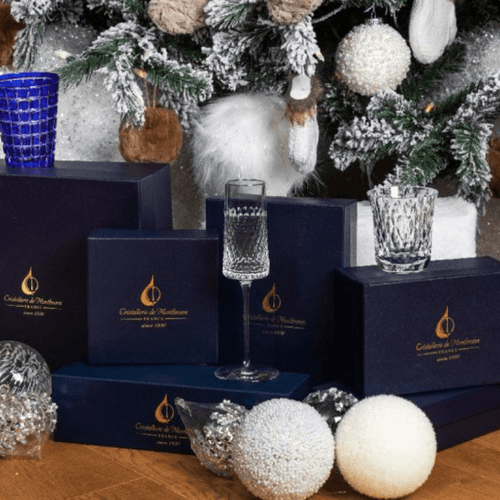
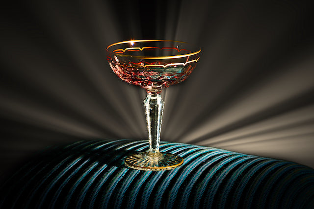
Being a light, vibrant colour, amber works best with darker colours, such as browns, reds, greens, and dark oranges. Its complementary colour is blue, specifically royal blue.
A COLOR OF NATURE...
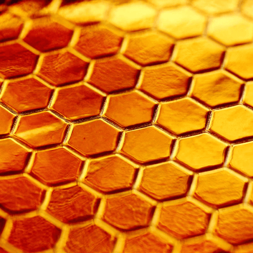
It is also possible to associate the colour Amber with nature, in which it is particularly found. For example, amber is the colour of honey of hives. Having a particularly precise and symmetrical hexagonal design, beehives are one of the many witnesses confirming that nature truly is perfect.
This natural beauty of the beehive is what inspired the creation of our new Hive ball vase. Entirely cut with precious hexagons, the Hive vase mimics the beehive design for major dexterity as well as the most luxurious refractory qualities. Conceptualized in Amber (but available in any of our colours), Hive is the perfect example of the muses nestled in nature that inspire our creative work.
Discover it now here

For more information on amber such as its history, its uses in interior design and its psychology, we invite you to visit the page directly dedicated to it here .
The complete team of the Cristallerie de Montbronn wishes you a pleasant November and looks forward to hearing your ideas, uses or simple feedback on our products soon!