AZURE
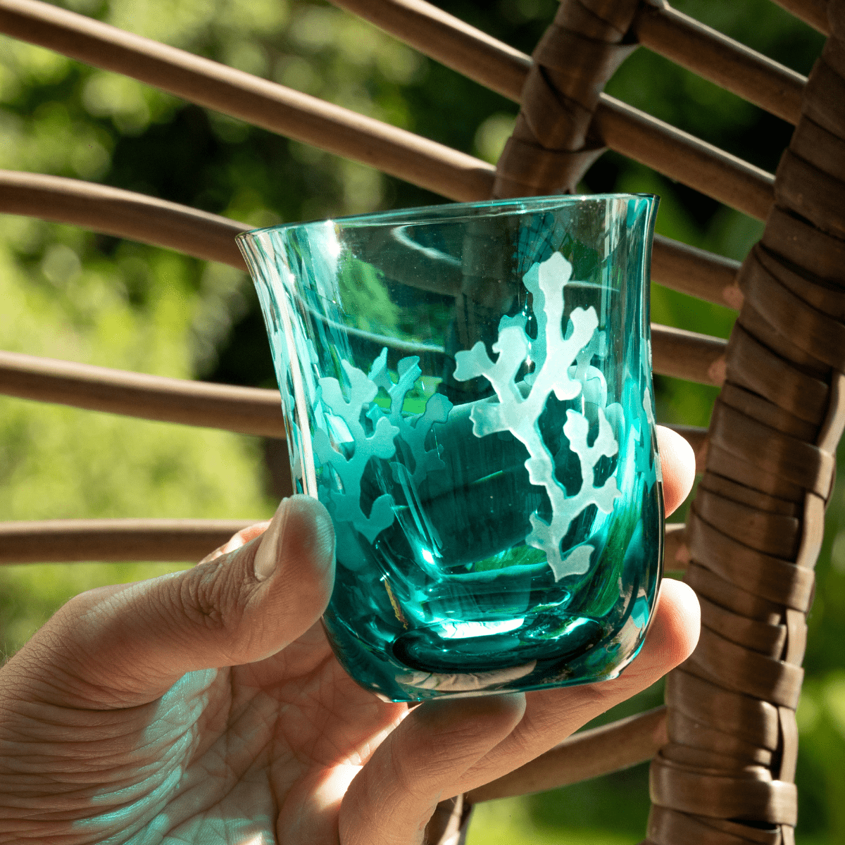
Our azure blue is a variation of cyan, which lies between green and blue.
HISTORY & ATTRIBUTES
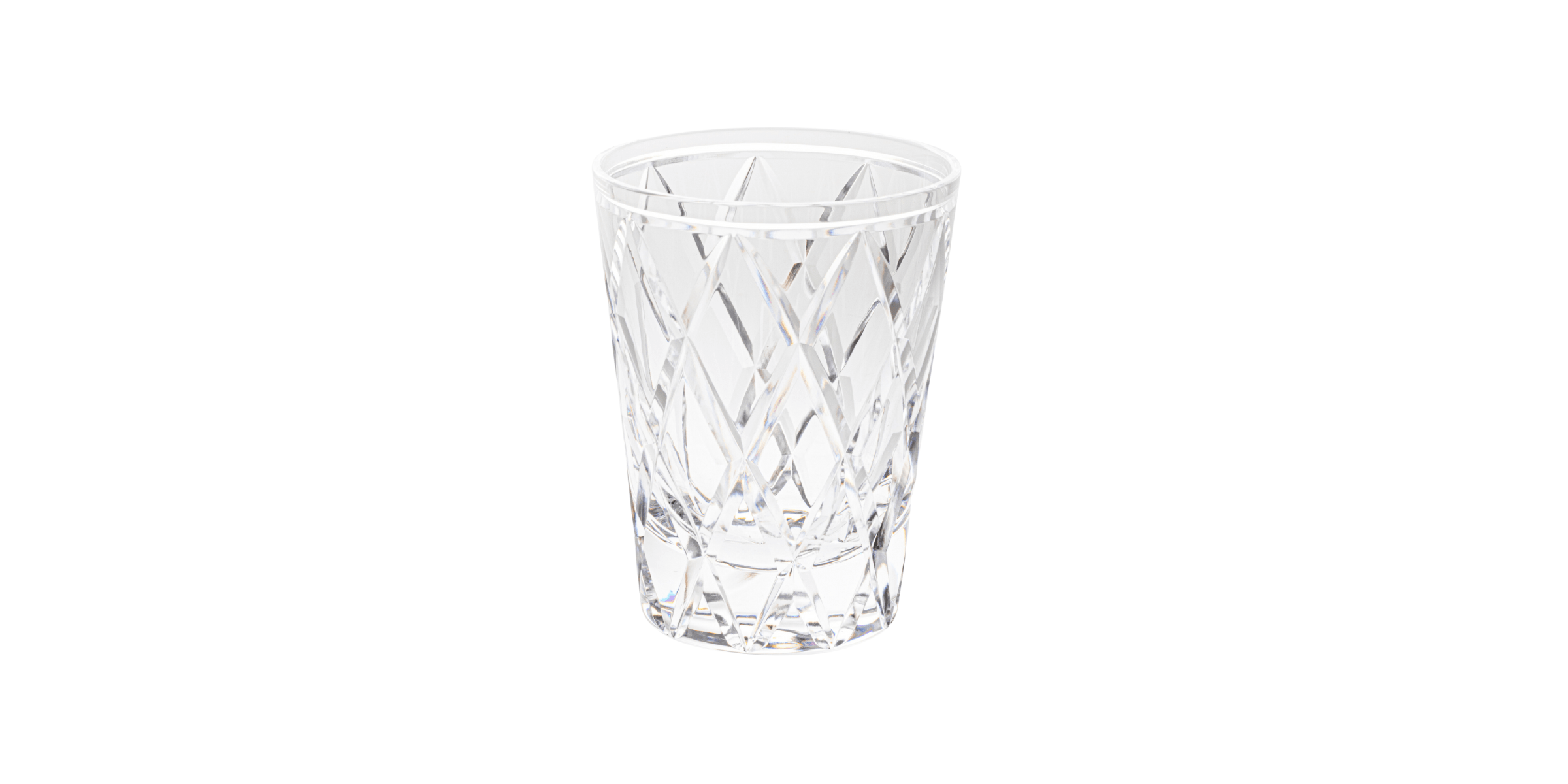
Before
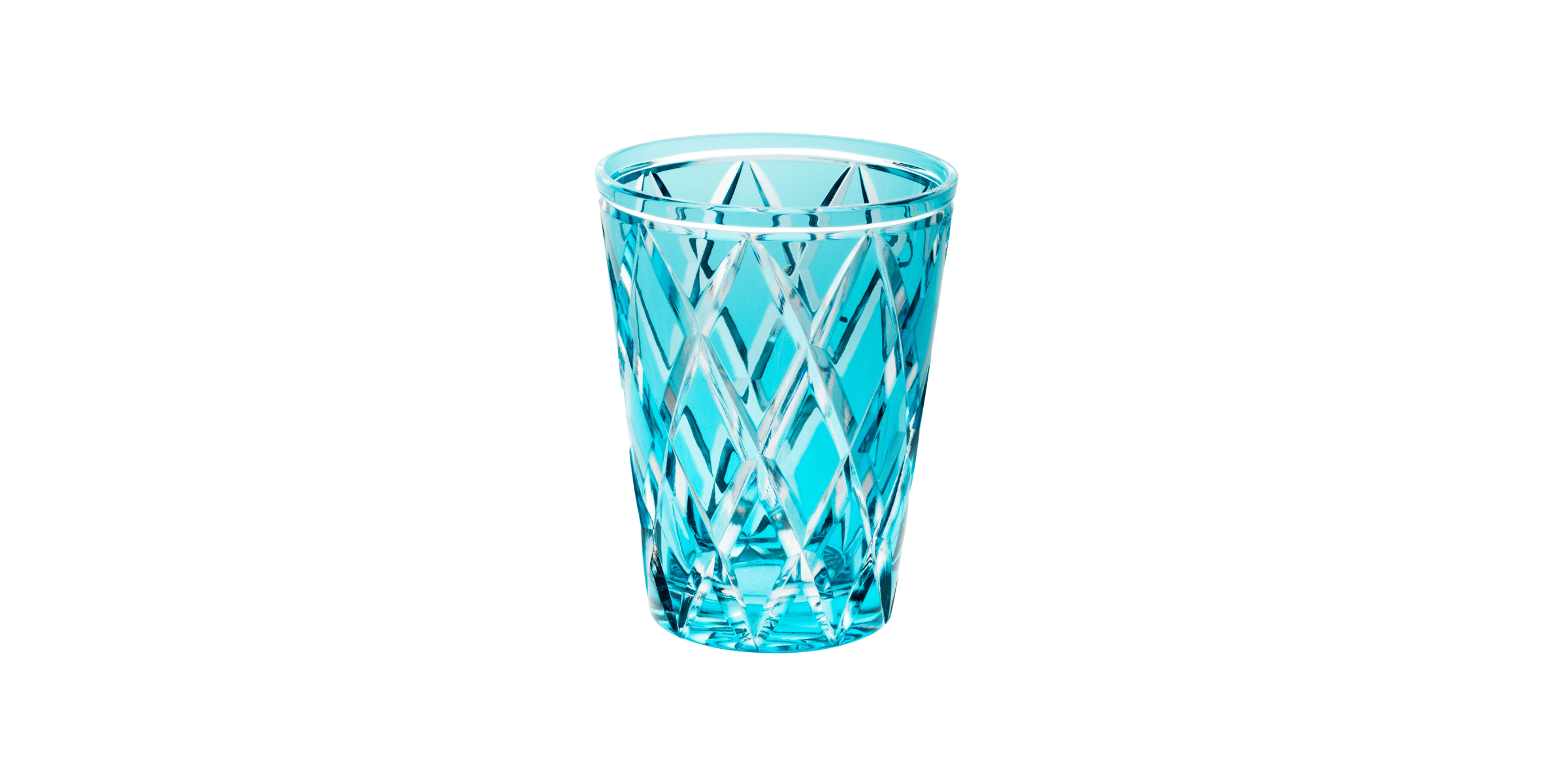
After
Our azure is one of our latest products and is very similar to aquamarine or Tiffany blue.
Like traditional blue, azure is associated with creativity and clarity of mind. Named after the precious stone lapis lazuli, this colour takes on the luxury of the stone but moves away from it in its colour, which is lighter and more vibrant. Azure also has a celestial connotation, as the word 'azure' is also used to describe the sky in all its splendour, particularly in poetry.
According to colour charts and colourists, azure can be seen as referring to the colour of the sky, provided that it is very intense, like a magnificent summer sky; or, on the contrary, it can also be seen as a pale colour, with an evanescent side.
At Cristallerie de Montbronn, we decided to name our new colour in this way for its connotations with the rich hue of a tropical sea and the elegance of stone.
Azure is particularly indicative of vigour, youth and exceptional dreaminess, making it a vibrant summer colour.
HOW & WHY SHOULD I USE IT?
Our azure is a perfect balance of blue, green and yellow. But it will also bring balance to your spirit: this colour is known for its serene and mind-stabilising effects. That said, it can also bring energy and cheerfulness to your space, triggering creativity and implying a fresh and sometimes even exotic effect. Radiating the tranquillity of blue, the nature of green and the energy of yellow, azure is a calm, friendly and happy colour that can help clarify thoughts. In design, our azure can be both warming and cooling, depending on its combinations with other colours, making it a versatile yet unique colour.


