LIGHT BLUE
Sky blue is a lighter shade of blue, very popular throughout history and ideal for interior decoration, tableware and fashion.
HISTORY & ATTRIBUTES
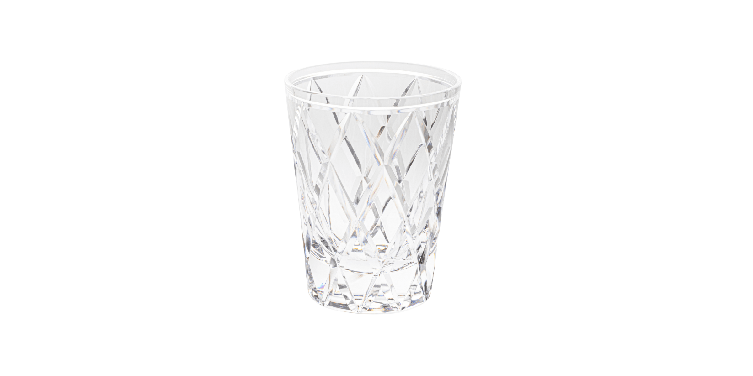
Before
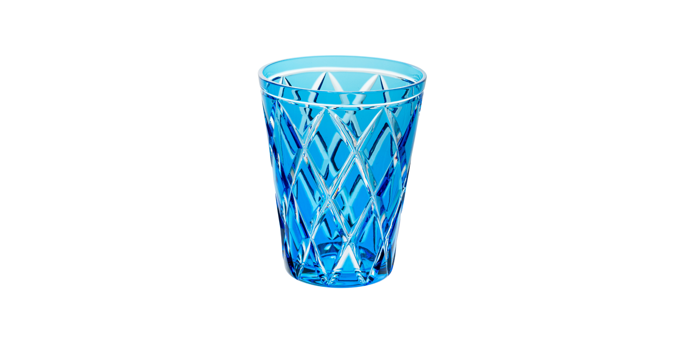
After
The name "light blue" was first used in 1915, but the colour blue has been used since ancient times. Prized by the ancient Egyptians, the colour was often used for decorations or hardware. Blue was the most expensive pigment during the Renaissance, and King Louis IX regularly dressed in it. Lighter, paler blues did not become popular until the Rococo era of the 17th and 18th centuries.
In the modern era, light blue is often associated with little boys. That said, in the 1910s-1920s, pink was the most appropriate colour for dressing young boys, as light blue was considered "more delicate and distinguished" and therefore reserved for girls. That said, the modern gendered conception of these two colours has existed since the 1940s. According to colour psychology, blue is associated with confidence and reliability, but is also considered to bring tranquillity. The softer appearance of light blue makes it a particularly likely candidate to give this impression.
Public surveys have shown that blue, being associated with little boys, is also generally associated with youth, innocence and childhood. Being a very popular shade, many polls show that blue is the favourite colour of more than half the world's population.
Finally, light blue is considered a good spring colour, as are other light or pastel variations.
How & why should i Use it?
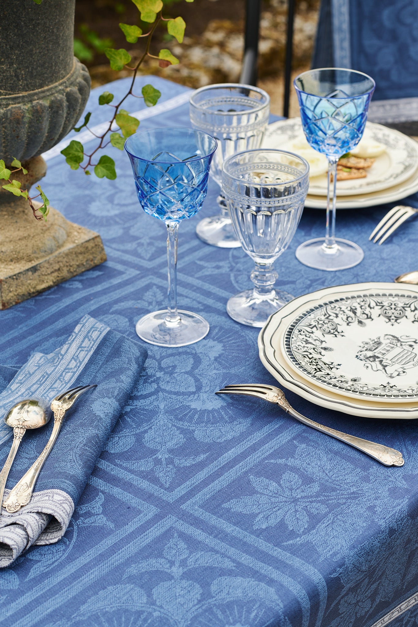
Popular and versatile, light blue can be used for a whole range of purposes and possibilities. Its calm, relaxed appearance is easy on the eyes and means that this shade can be used in large quantities, without feeling saturated or overpowering. Blue's association with confidence and reliability makes it a common choice in corporate logos, but it also associates with the sky, the sea and the eye.
Light blue can also be an excellent alternative to darker shades of blue such as dark blue or navy, which can appear too harsh or even gloomy in large doses to some eyes. This shade is very popular in fashion and design for its relaxing and welcoming qualities, particularly in interior decoration.


