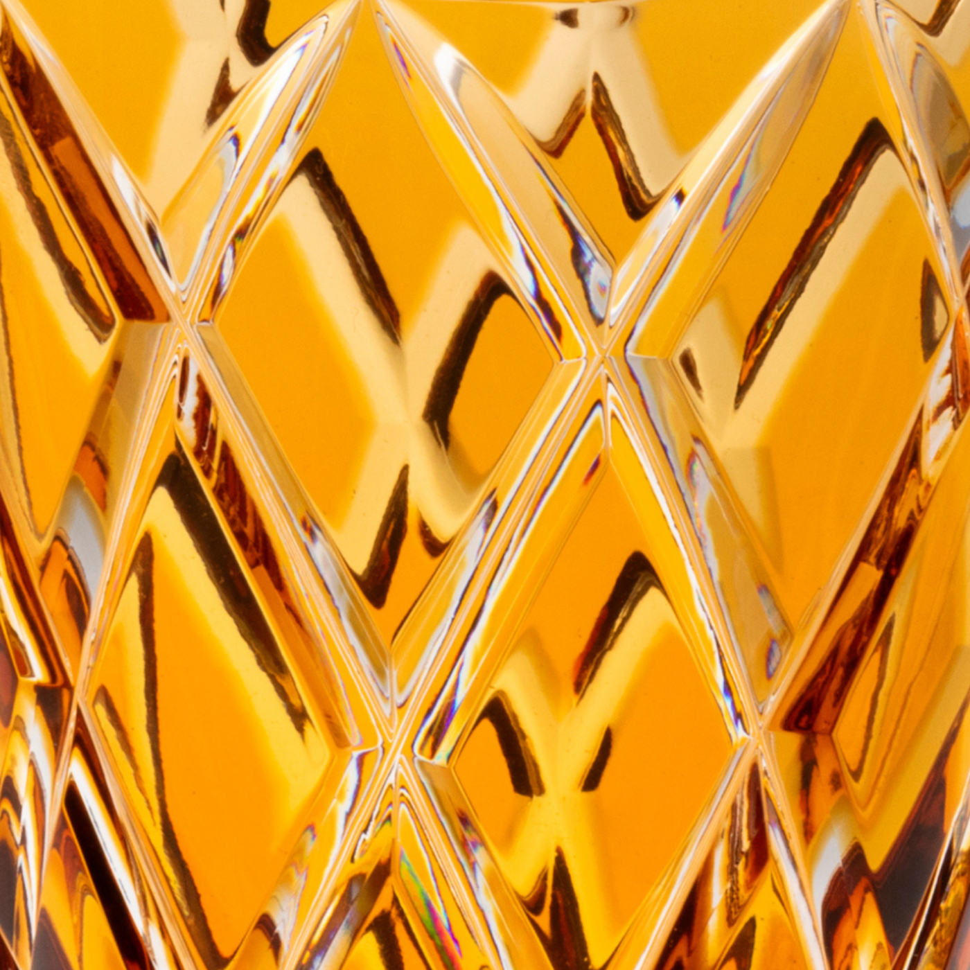
DARK BLUE
Dark blue can often be confused with navy blue, as they are closely related. Yet the cool, deep shade of dark blue is unique enough to stand on its own.
HISTORY & ATTRIBUTES
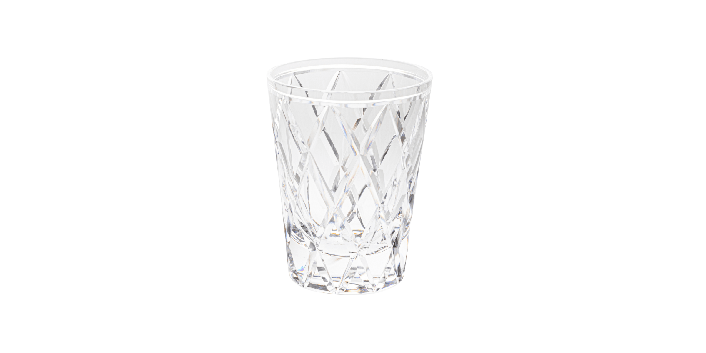
Before
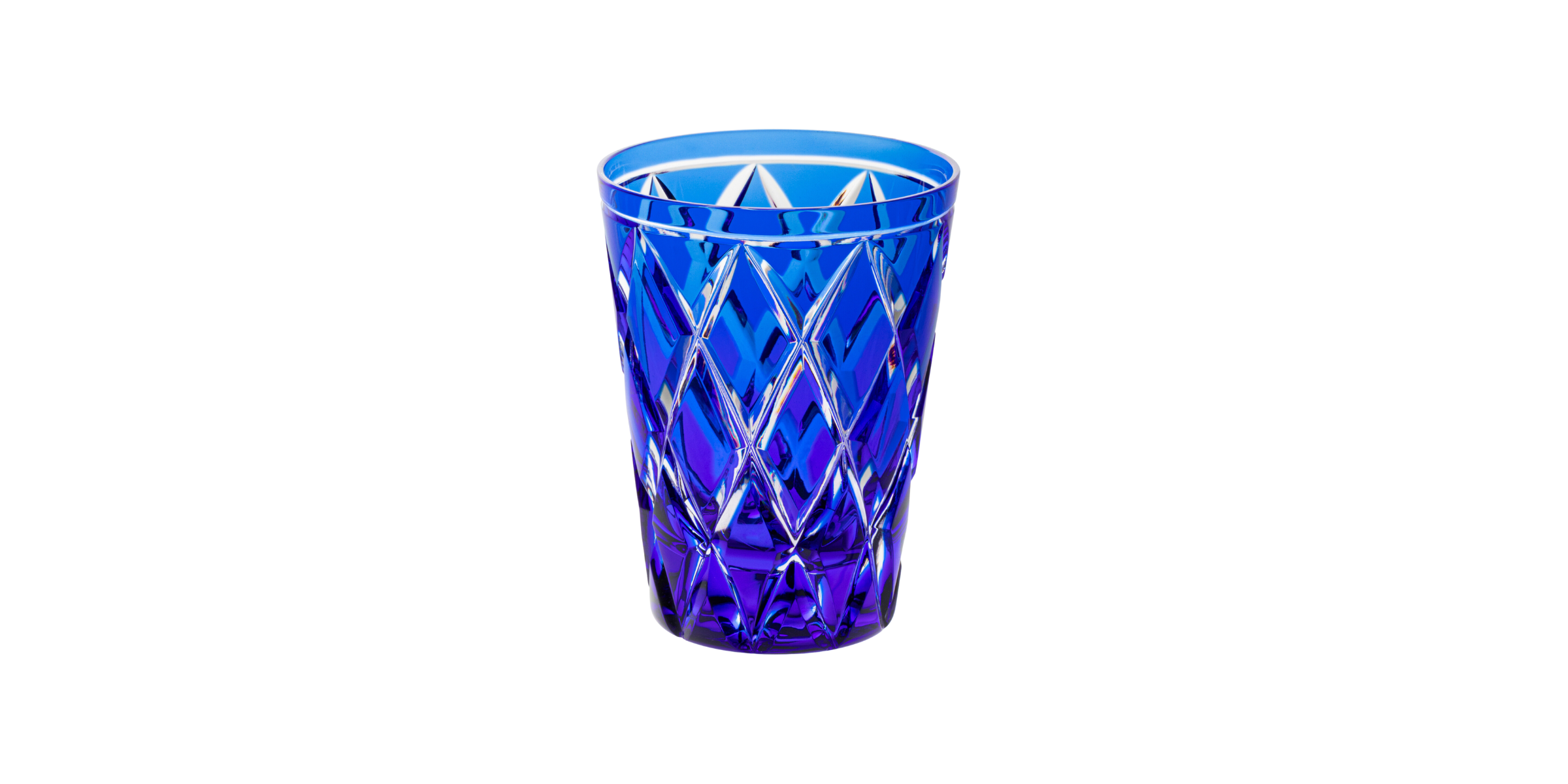
After
Blue has long been associated with royalty, art, the military, business and nature, making it a colour with many applications. The first documented use of the blue pigment was in azurite, an intense blue natural mineral widely used in ancient Egypt for decoration and jewellery. Later, during the Renaissance, the mineral was ground and used as an expensive paint pigment, ultramarine.
The name "dark blue" was first used in 1915. This hue is named for its resemblance to the very dark blue of a night sky around a full moon. Although the colour's name is relatively recent, midnight blue skies can be seen in works by Vincent Van Gogh dating from the 1800s, such as Starry Night.
In the 1920s, the Duke of Windsor in England, Edward VIII (1894-1972), popularised dark blue as an exceptional colour for suits and dinner jackets. He believed that, unlike black, dark blue eveningwear would allow photographs to capture the tailor's subtle details, such as pockets, lapels and buttons, and thus enhance his status in the press.
In addition, dark blue is a colour rich in both history and entity, making it ideal for both traditional and resolutely modern interiors. Its saturation and hue make it an autumn-winter colour.

How & why should i use it?
Dark blue is often used to represent elegance, authority and intelligence, and is a versatile and timeless colour.
Synonymous with sophistication and elegance, its association with formal occasions and royalty means that it conveys power and authority. According to colour psychology, blue is associated with confidence and reliability; its darker shades, in particular, are linked to authority and intelligence.
In interior design, an accent of dark blue can give a refined impression to a room, but it's best to avoid using too much of this hue as its dark appearance or exceptional saturation could become oppressive in large doses.
Finally, it's the ideal candidate when black is too harsh.


