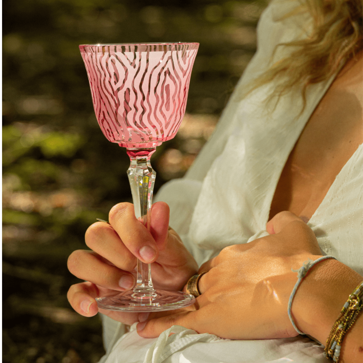
PINK
Pink traditionally falls between red and magenta and is one of the main colours associated with romance.
HISTORY & ATTRIBUTES
Before
After
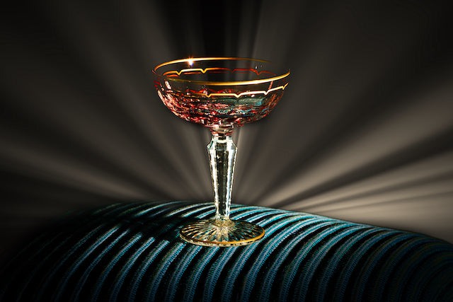
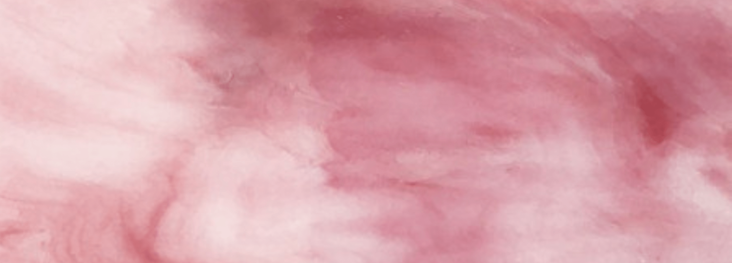
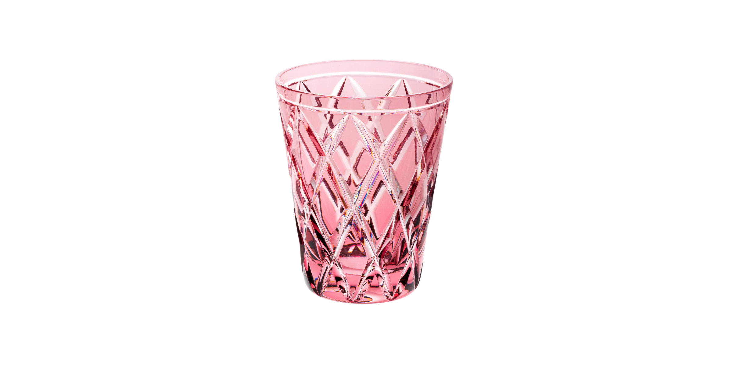
At Cristallerie de Montbronn, the colour pink is a lighter, more subtle pink that compliments the crystal and its refractory qualities.
The origins of the colour pink, better known in Latin as rosa, come directly from the flower of the same name. That said, there are a number of different types of rose, ranging in hue from classic red to light pink and a whole range of rich, naturally elegant shades. Universally associated with love, pink has nevertheless appeared throughout history as a personal, political and religious colour. In ancient Greece, roses and their colour were associated with Aphrodite, but the ancient Greeks and Romans also wore garlands of roses as a sign of celebration and gathering. A Dictionary of Colour by Paul and Maerz suggests that the first use of the word 'rose' to define the colour dates back to 1382.
Traditionally, the colour pink has always been strongly associated with women because of its warmth, softness and link with love and emotions. It is also associated with beauty and positivity. For example, "seeing life in pink" describes a particularly romantic and optimistic way of looking at all of life's situations and environments.
How & why to use it?
When used in art and design, pink generally depicts a sense of vibrancy, beauty and warmth. Light pink represents elegance, femininity and refinement, while warm pinks can represent appreciation and recognition. Pale pink evokes joy and gentleness, while red roses convey true love, passion and desire.
Our pink is a particularly light and elegant shade that also recalls touches of the colour "champagne", bringing to mind the effervescence of the drink. So our rose also evokes feelings of joy.
WITH WHAT COLOURS ?

PASTEL GREEN
For a peaceful spring look.

LIGHT BLUE
Soft blues for a dreamy mood.
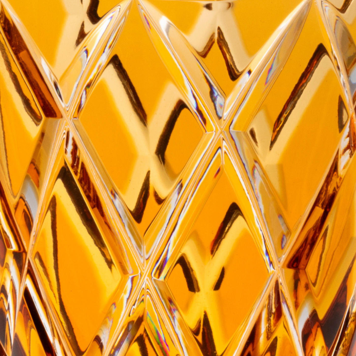
Amber
For a retro look.